I'm a Product Designer solving 0-to-1 problems for AI-native startups. By day, I design scalable systems at BNY Pershing. By night, I'm angel investing and exploring the future of AI + design.
I help founders build AI-native products with real social impact through strategic design thinking and hands-on execution.
Connect
I'm always interested in discussing design, AI, and product strategy. Feel free to reach out.
BNY Pershing was consolidating two platforms into one. I helped reimagine how advisors open accounts and move assets—two workflows that touch millions of dollars daily but were failing users at every turn.
Dimension
Details
My Role
Studio Designer (collaborative team, I designed the To-Do List pattern for NAO and the collapsing stepper for Asset Movement)
Team
2 Studio Designers, Design Lead, Product Partners, User Research Team
Timeline
~8 months
Outcome
Validated designs ready for future development as platform consolidation continues
Two platforms, one future
BNY Pershing's Wealth Services group operates two platforms: NetX360+, a legacy system used by traditional broker-dealers and their advisors, and Wove, a newer platform built for RIAs. The company's strategy is to eventually consolidate these into a single unified experience—Wove—with different features white-labeled based on client needs.
But you can't flip a switch. NetX360 has decades of features that Wove doesn't yet support. The transition happens piece by piece, workflow by workflow.
Our team was asked to envision what two critical workflows—New Account Opening and Asset Movement—should look like in this future state. Not incremental improvements to the legacy system, but a rethinking of how these experiences should work when built from the ground up.
🔀
Platform context diagram or visual showing NetX360 → Wove transition
🔍
The Research Revealed a Common Enemy
Before diving into solutions, our research team conducted extensive discovery. The Custody Client Research surveyed clients across key personas—advisors, operations, client associates, compliance managers, and senior leaders. A separate NAO Design Validation study conducted moderated sessions with advisors, CSAs, and home office personas to understand the current experience in depth.
The findings were stark. When asked to rate pain points across all their responsibilities, advisors rated "Onboard clients and/or open accounts" as the single highest pain point—higher than trading, transfers, or any other task.
Quantitative research confirmed what interviews revealed: account opening was the most painful task advisors faced.
The primary challenge was clear:
"Manual and repetitive work emerged as a significant hurdle across various operational aspects."
But the research went deeper than that headline. Four themes emerged that would directly shape our design approach:
Intuitiveness > Efficiency — Reducing human input (including calls to reps, tech engineers, help desks) is critical. Intuitiveness directly correlates to speed.
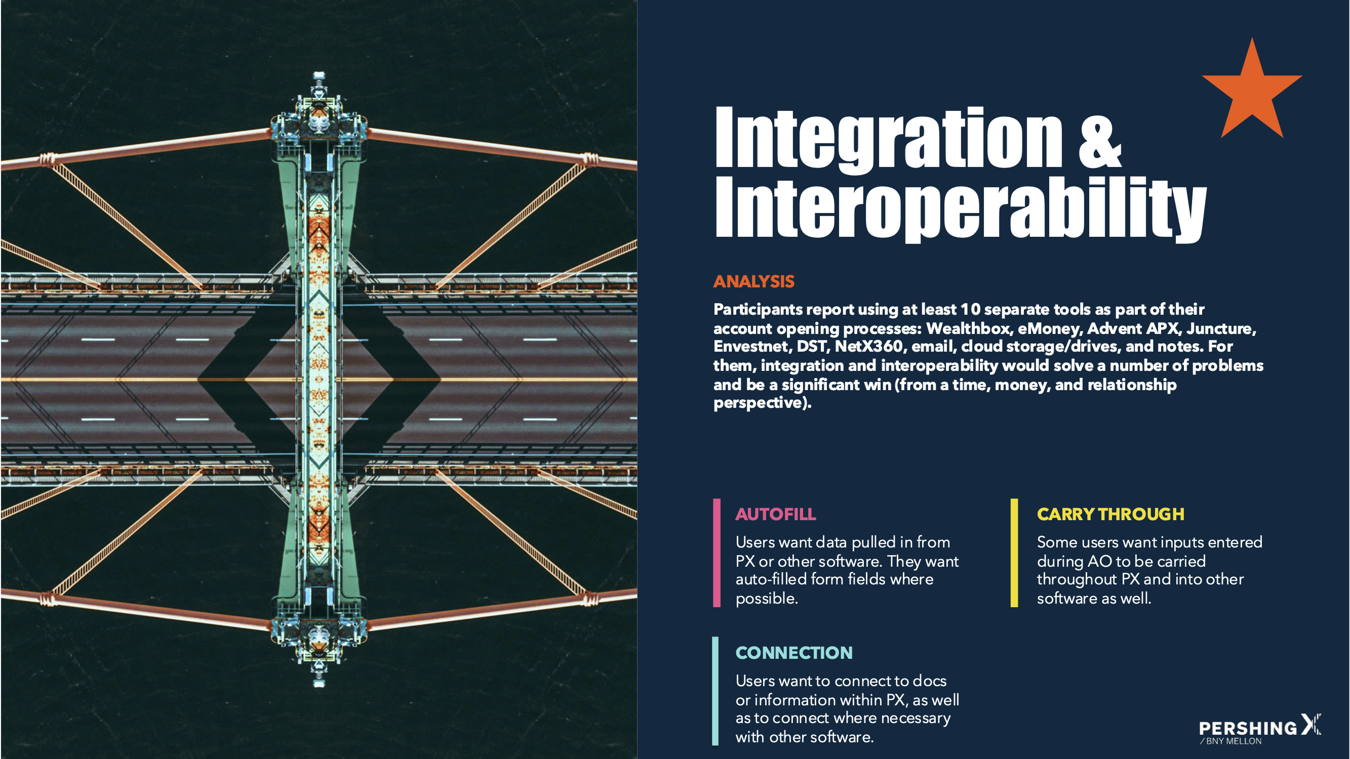
Integration & Interoperability — Users want data entered once and populated throughout. They want connection to their existing tools.
Less is more — Users want to complete only required fields. Less input means more time saved, more brainpower for other tasks.
Information Organization — Users want systematic ways to track information, clearer communication about what's required vs. missing, and progress visibility.
Research synthesized into four design principles: intuitiveness, integration, minimalism, and organization.
Part One
New Account Opening
📝
A Form Pretending to Be a Workflow
Ten tools, thirty days
The research revealed something striking: participants reported using at least 10 separate tools as part of their account opening processes—Wealthbox, eMoney, Advent APX, Juncture, Envestnet, DST, NetX360, email, cloud storage, and handwritten notes.
The process took anywhere from 3 to 30 days depending on account type, compliance requirements, firm-specific processes, and how much back-and-forth was needed to gather client information.
This wasn't a usability problem. It was an ecosystem problem.
Research finding: advisors juggled 10+ tools with no unified workflow
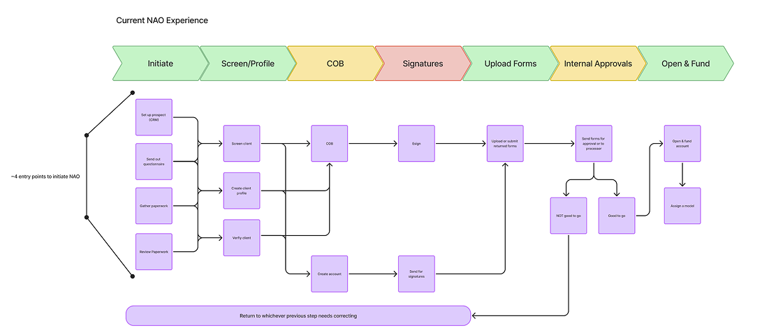
A form pretending to be a workflow
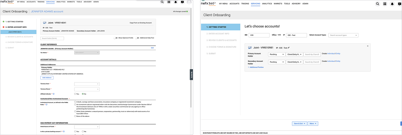
In NetX360, account opening presented itself as a 5-step process: Getting Started, Enter Account Info, Review Clients & Accounts, Choose Forms & Signature, Submit.
The reality was different. Behind "Enter Account Info" sat a seemingly endless scrolling form—dozens of fields spanning client details, account attributes, regulatory requirements, custodian features, and more. Users had no way to know how much was left, what was required versus optional, or whether they'd missed something critical.
The legacy interface: a 5-step wizard hiding a monolithic form. Users had no visibility into progress or sub-tasks.
"Once you get started, you just want to get through it"
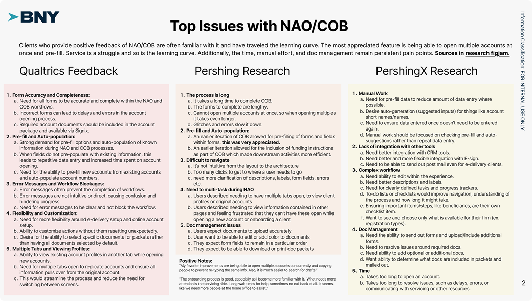
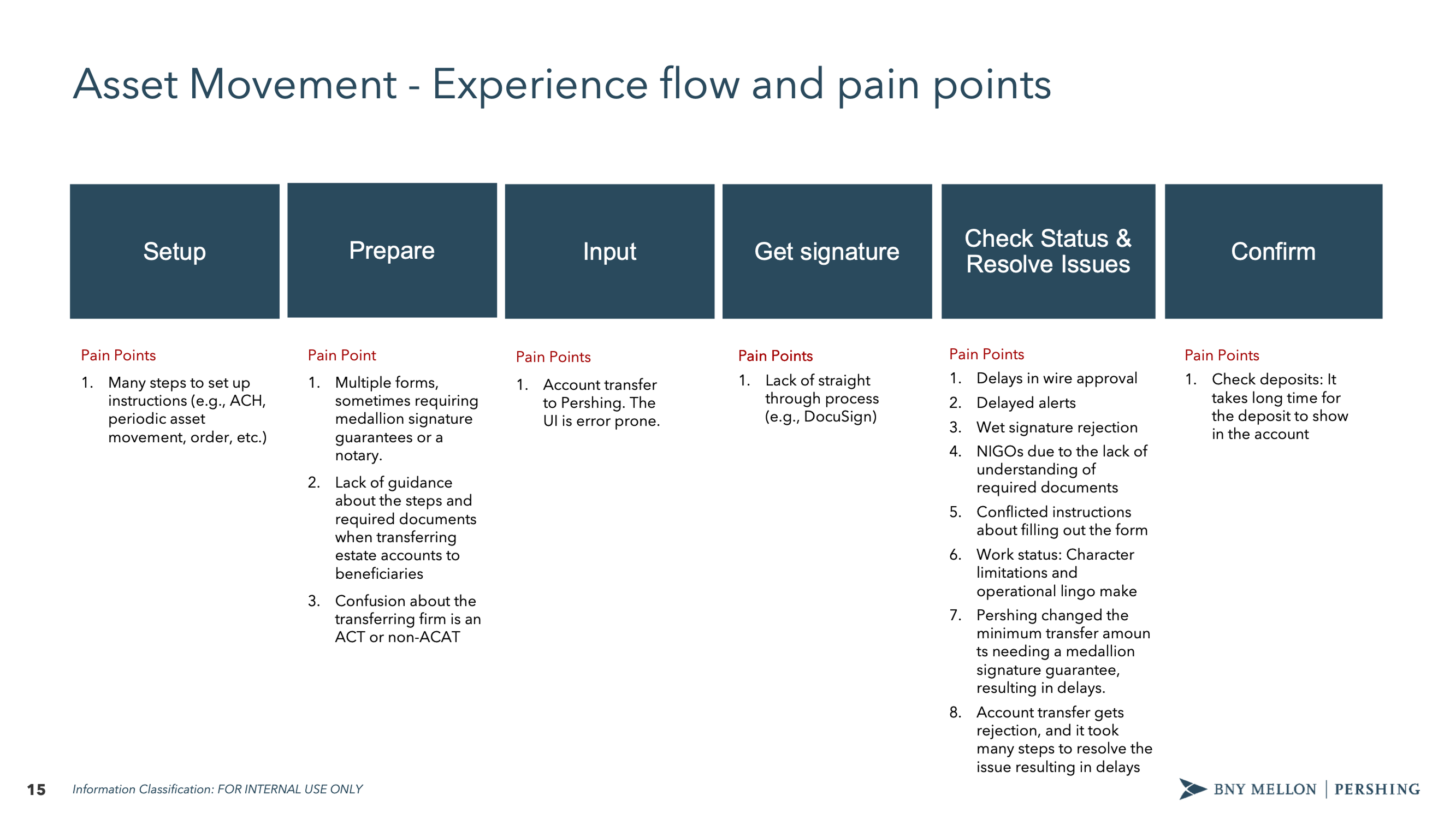
The research mapped the full journey across six phases: Setup → Prepare → Input → Get signature → Check Status & Resolve Issues → Locate new account. Pain points clustered at every phase, but the worst were at "Check Status & Resolve Issues"—where NIGOs (Not In Good Order rejections) piled up.
Pain points mapped across six phases. NIGO issues clustered at status checking, where users struggled to understand what was wrong and who could fix it.
The problems were specific and consistent across firms:
Configuration didn't flow. When users copied an existing client's configuration, details like e-delivery preferences wouldn't carry over. Joint account configurations would apply to one account but not the other.
"My eDelivery preferences, I should be able to do that across the board for everybody or my additional account information—none of this ever flows over. I want it to be the same across everybody across all account types. I can tell you this is very, very time consuming."
— First Command
Systems didn't talk to each other. Users worked in parallel systems—NetX360 open alongside their CRM—manually syncing status between tools.
"Our CRM doesn't talk to NetX360 at all, so they're advisors basically doing it in parallel. They've got NetX360 open, and they've got the CRM open, so they have a Pershing account assigned to them, they go upload the documents into NetX360 to kick off this account opening. Then update my workflow and now the account got opened. In the CRM they mark the account got open, account open date."
— Ops Manager, Captrust
Multiple accounts meant multiple envelopes. Opening five accounts for a client meant sending five separate signature envelopes—a frustration that should have been simple to solve.
"If we have multiple accounts, we'll open multiple accounts. We would like to have instead of five different envelopes go, if it's five different accounts, have one envelope go."
— COO, Davenport
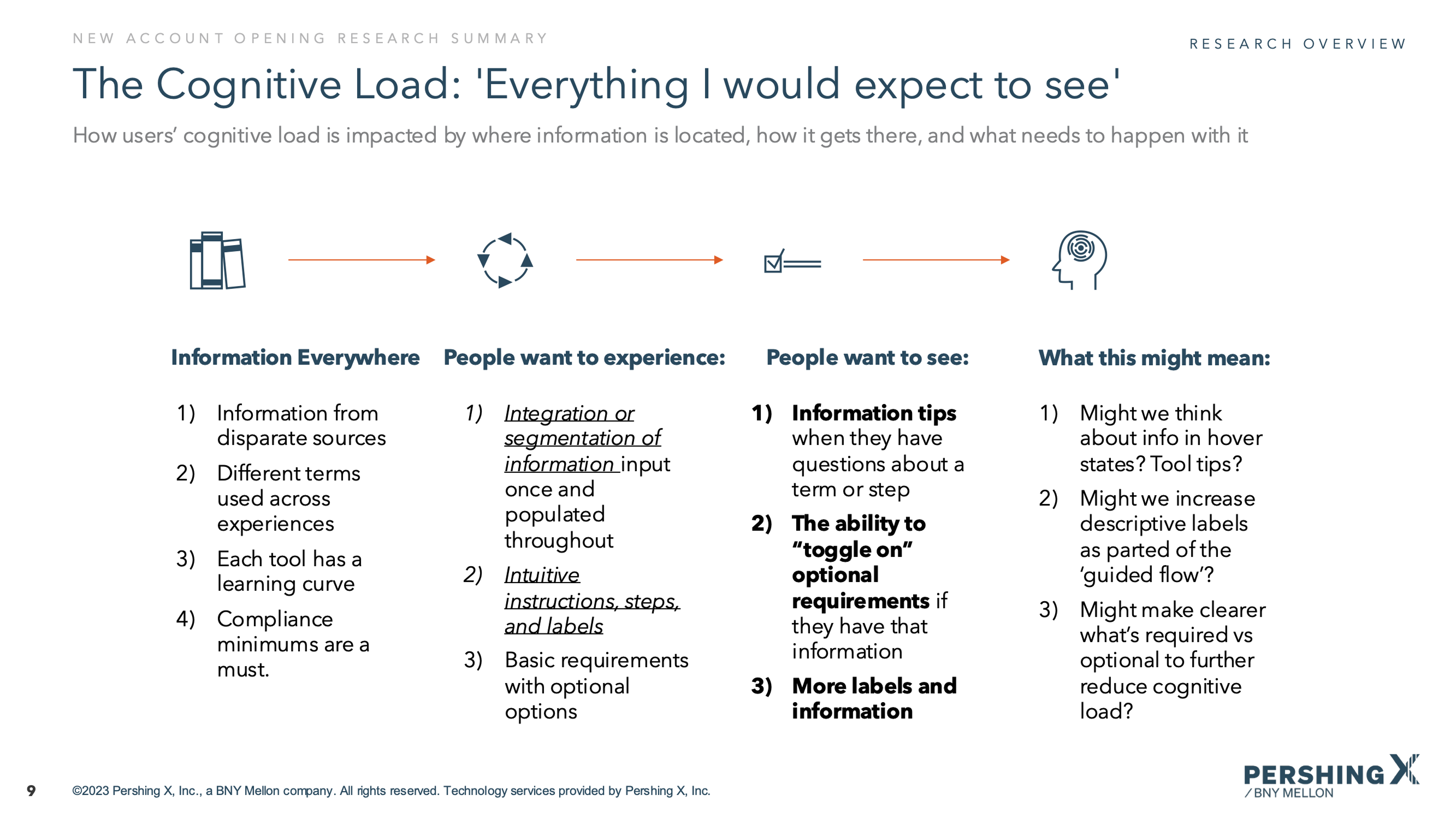
The cognitive load problem
Research revealed that users were drowning in information from disparate sources. Different terms were used across different experiences. Each tool had its own learning curve. Compliance minimums varied by firm.
What users wanted was clear:
Information tips when they had questions about a term or step
The ability to "toggle on" optional requirements if they had that information
Checklists of missing or required info so they could track what was pending
The ability to send forms to clients for signatures or to gather missing information
Research: advisors described the onboarding process as cognitively exhausting
The information gap
Research surfaced another critical finding: advisors rarely have all the information they need during onboarding. They collect what they can, then have to chase clients for missing details—income verification, beneficiary information, regulatory disclosures.
Users wanted to move through the process with missing or pending information, then easily enter it when they had it. They wanted integration with their CRM and financial planning tools. And they wanted the ability to send forms to clients directly rather than playing telephone with sensitive data.
Validation research: mapping the user journey and experience gaps
Reframing the problem
The research painted a clear picture. This wasn't about making forms shorter or interfaces prettier. It was about four fundamental problems:
Visibility — Users couldn't see where they were, what was done, or what was blocking them
Flexibility — Linear forms didn't match non-linear work; users needed to jump around
Integration — 10+ tools meant constant context-switching and manual data entry
Communication — Missing information required chasing clients through separate channels
Our design benchmark became the "Turbo Tax-like experience" that research participants referenced—guided, intuitive, and flexible enough to handle complexity without hiding it.
The Core Question
"How might we make a complex, multi-participant workflow navigable without hiding its true complexity?"
🔭
Exploring the Solution Space
Before landing on a final direction, we systematically explored different patterns across multiple dimensions. The research gave us clear problems to solve; now we needed to find the right structural approach.
Exploration phase: mapping competing navigation patterns before selecting a direction
Pre-flow: Reducing complexity before it starts
One insight from research was that users spent too much time configuring accounts that could have been set up faster with the right upfront questions. We explored a pre-flow pattern that would capture key decisions—custodian, account type, sub-type—before entering the main form.
This served two purposes: it reduced the number of irrelevant fields users would see (by filtering based on account type), and it gave users a sense of momentum before hitting the longer form sections.
Pre-flow: upfront configuration reduces irrelevant fields before the main form
Navigation patterns: Three competing approaches
For the core flow, we explored three distinct navigation patterns:
Approach 1: Sidebar stepper
A traditional stepped sidebar showing major sections (Client Details, Account Details, Documents, Funding Instructions, Review). Linear, familiar, but limited visibility into sub-tasks.
Approach 1: sidebar stepper — familiar but limited visibility into sub-tasks
Approach 2: To-Do dashboard
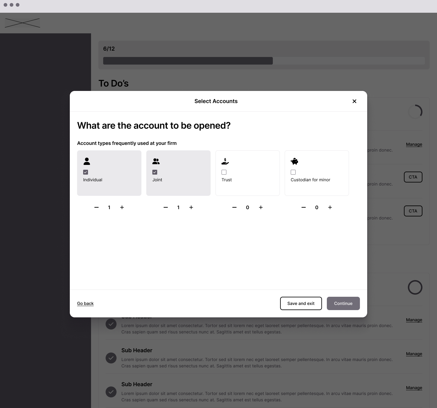
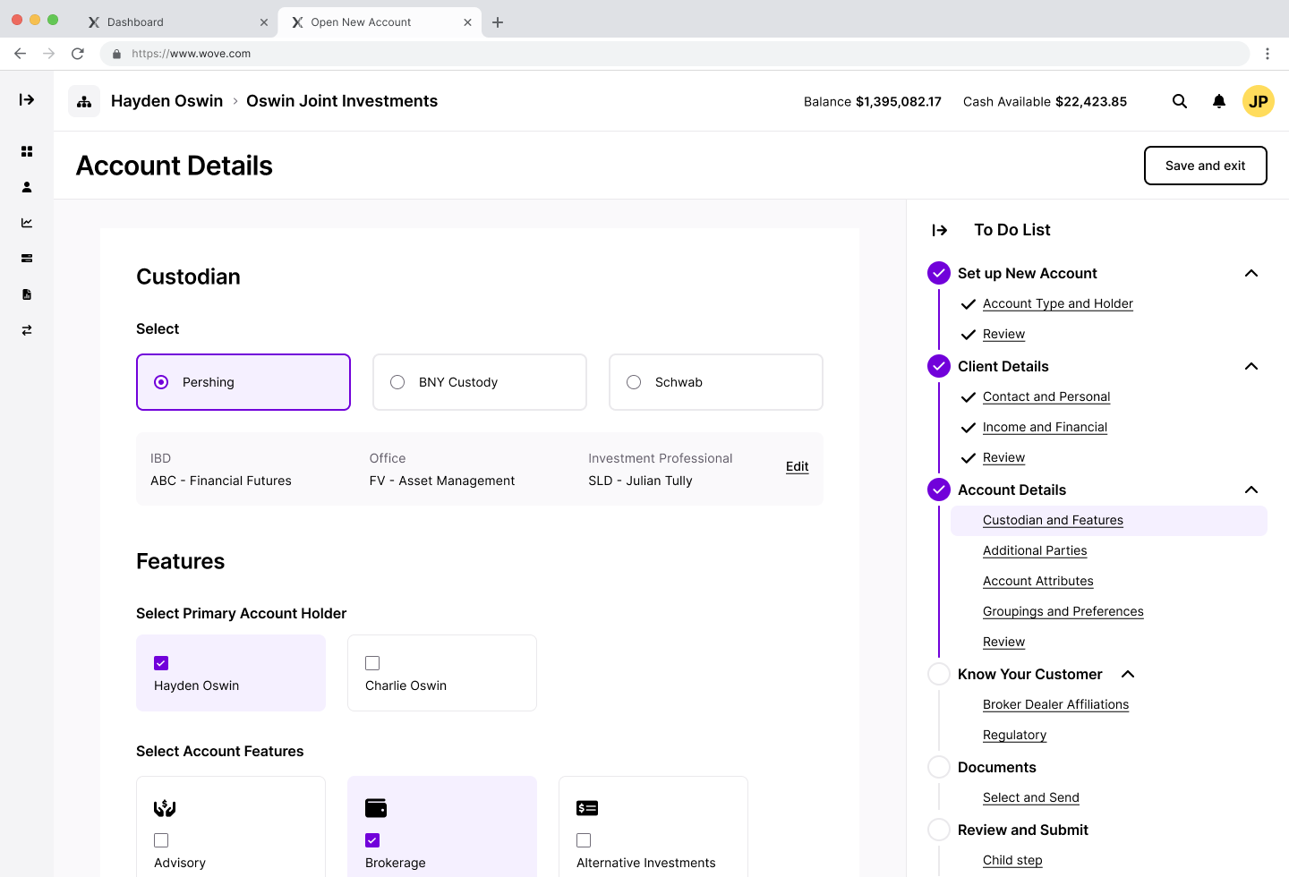
A fundamentally different model—presenting the entire workflow as a task list with progress percentages. Sections would show completion status and expand to reveal remaining items. This approached NAO as a project to manage rather than a form to fill out.
Approach 2: To-Do dashboard — NAO as a project to manage, not a form to fill
Approach 3: Full-page form with progress
Keeping the form as the primary experience but adding progress indicators and section navigation. Less structural change, more incremental improvement.
The questions we were solving for
The exploration phase surfaced key design questions we needed to answer:
Where should the To-Do list / stepper be on the page? Sidebar? Top? Collapsible?
Where is the "Next" button? Fixed at bottom? Inline with content? In the navigation?
How do we handle sub-flows? Modal? Full page? Dedicated flow?
What's the right level of granularity? Major sections only? Every field group?
These weren't just visual decisions—they had implications for how users would understand and navigate the complexity.
Open exploration questions: where does the "Next" button live? How do we handle sub-flows?
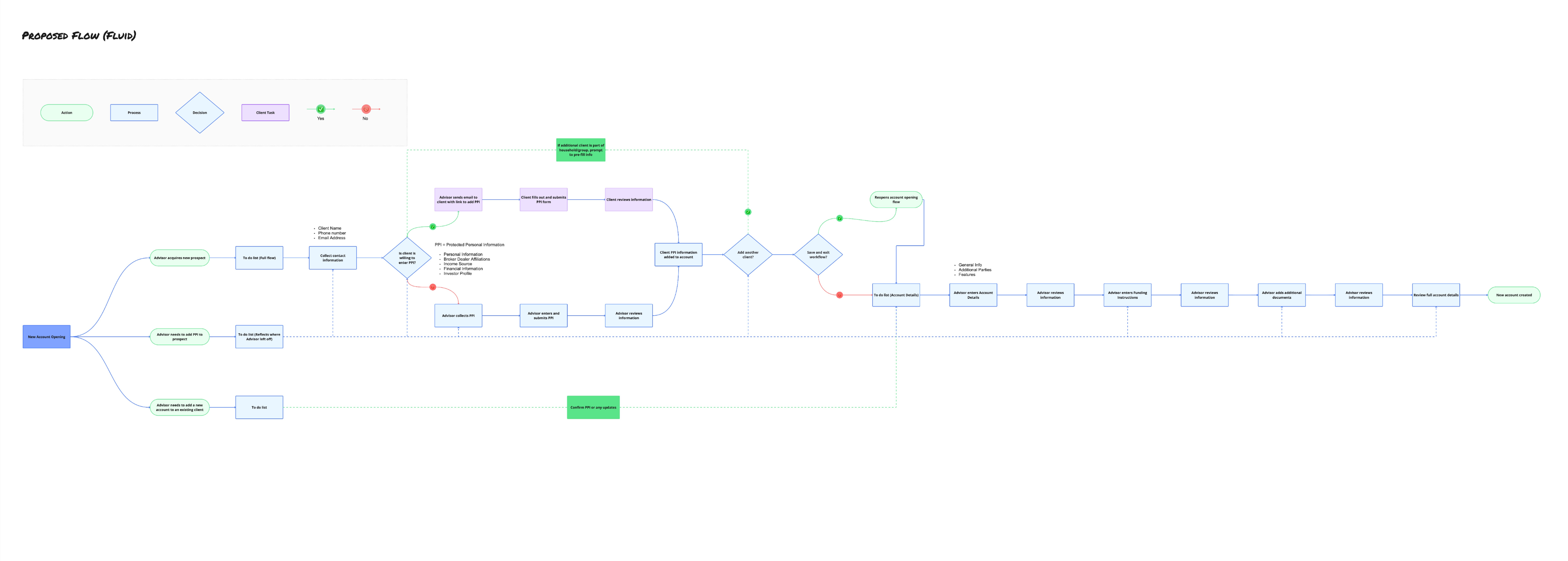
The collaborative flow
One exploration directly addressed the research finding about advisors lacking complete information. We designed a flow where advisors could invite clients to fill in their own protected personal information (PPI)—things like Social Security numbers, income details, and financial information that clients might not want to share verbally.
The flow branched: advisors would collect basic contact information, then send a secure link to clients. Clients would fill in their section, the data would merge into the account, and both parties could see what was complete and what was pending.
Collaborative flow: advisor collects contact info, sends secure link to client, data merges automatically
This concept influenced the final design—the "Send to client" toggle that appears on form sections came directly from this exploration.
"Send to client" toggle: advisors can hand off sensitive data entry to the client directly
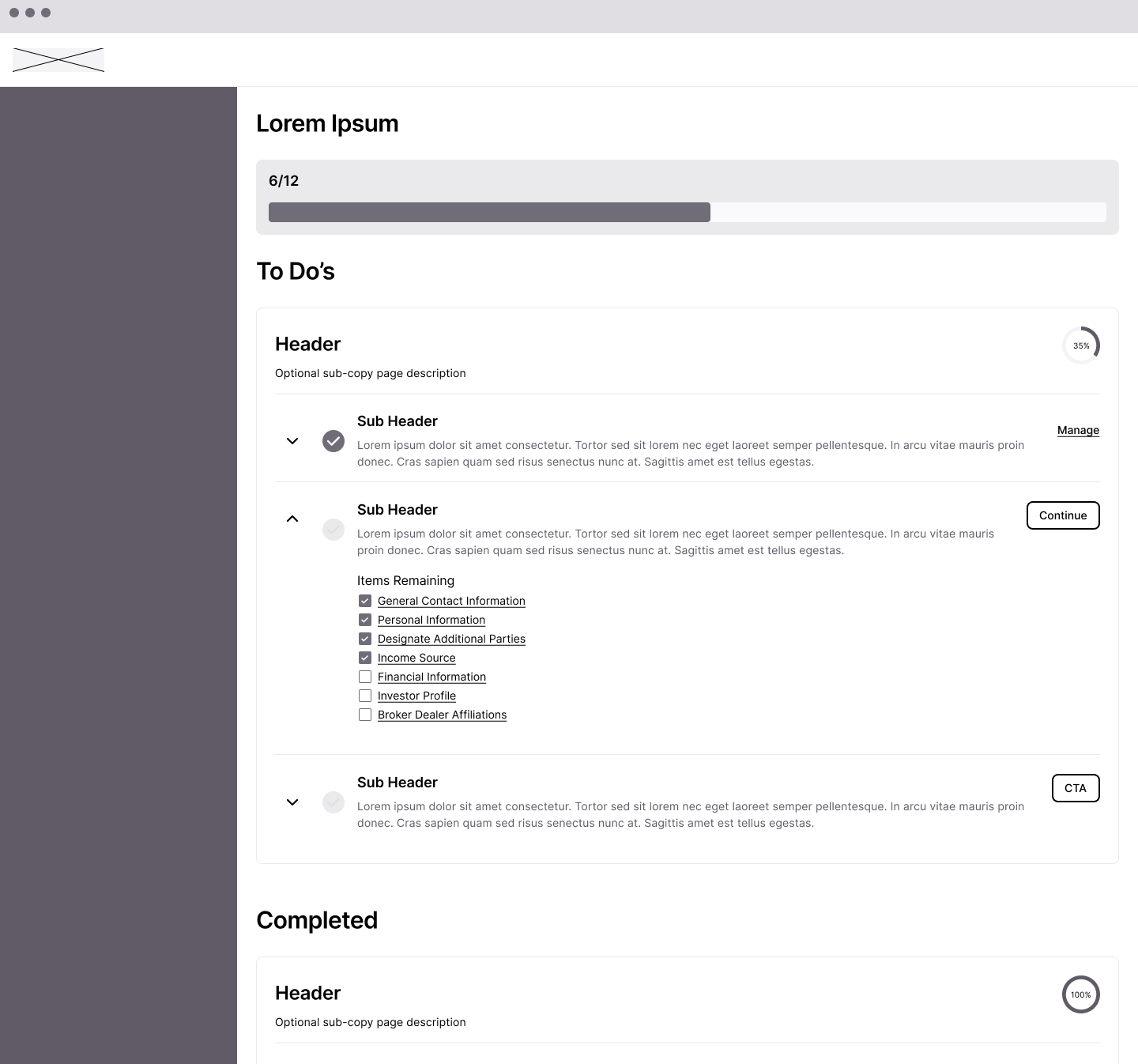
The To-Do List pattern emerges
After exploring multiple approaches, the To-Do List pattern emerged as the strongest solution. It combined the progress visibility of the dashboard approach with the navigational clarity of the sidebar stepper.
The key insight: instead of either a linear stepper OR a task dashboard, we could have both—a persistent navigation that shows every section, with completion status visible at a glance and the ability to jump to any section at any time.
Final NAO design: persistent To-Do list combining progress visibility with non-linear navigation
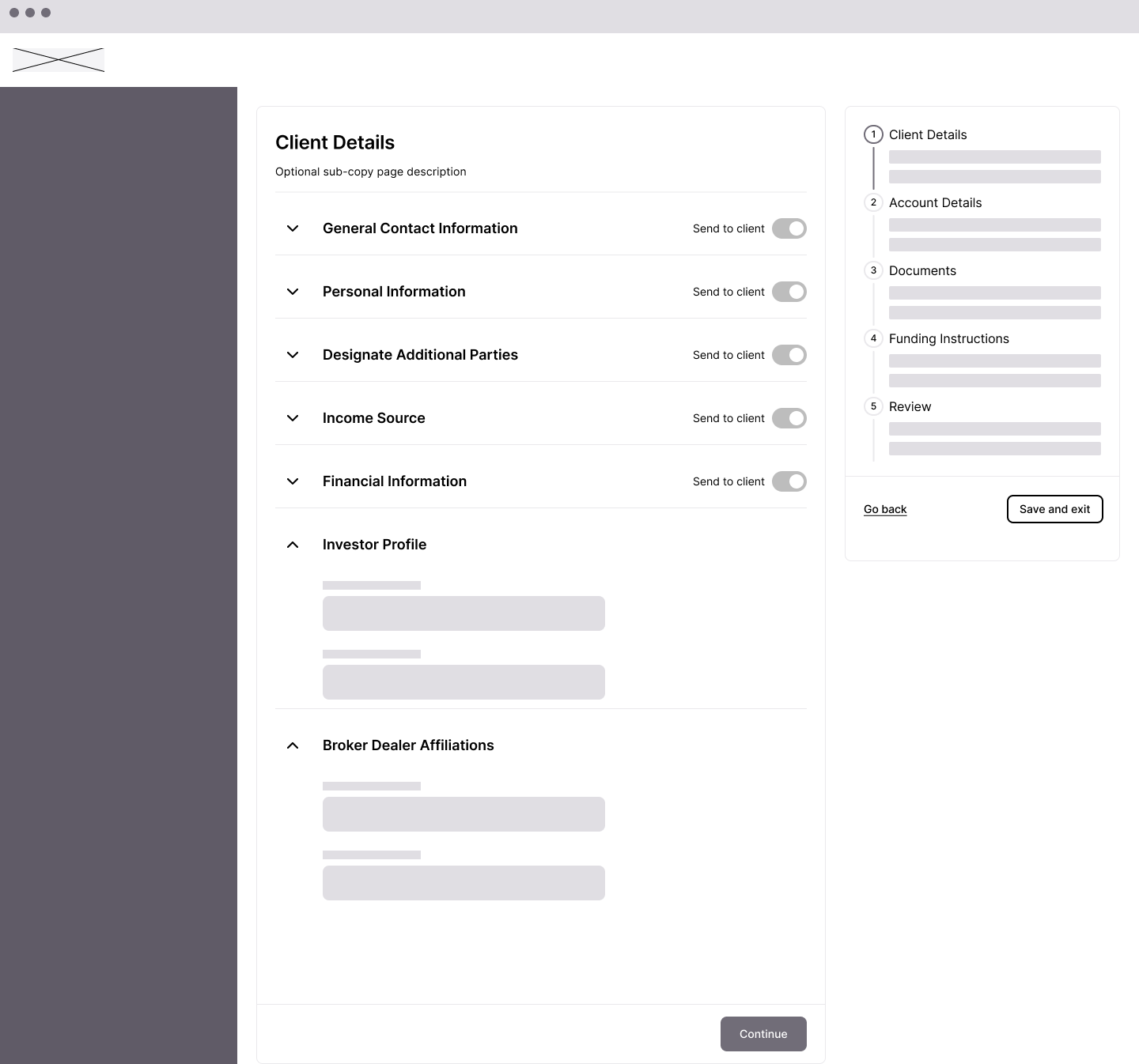
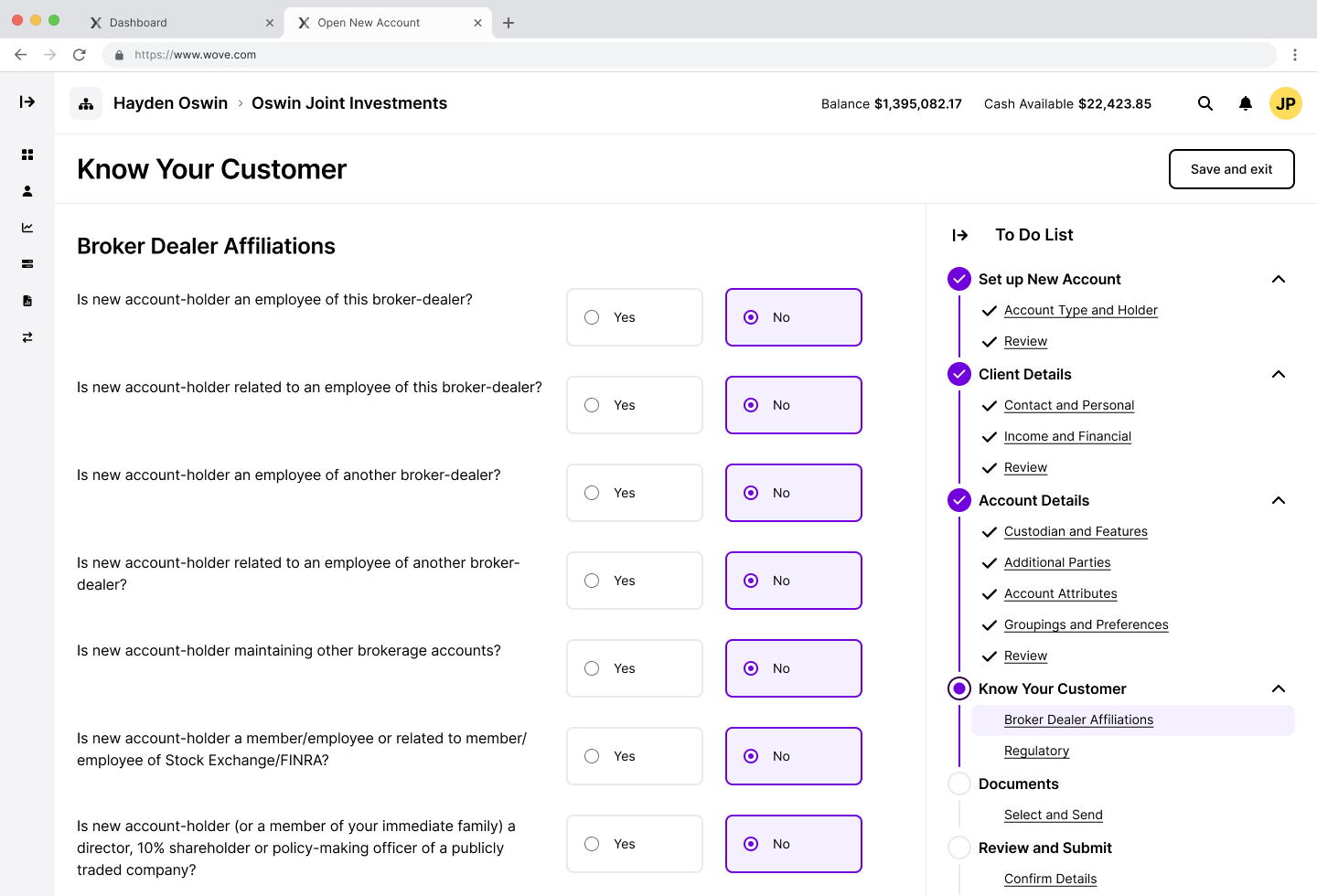
KYC: A research-driven separation
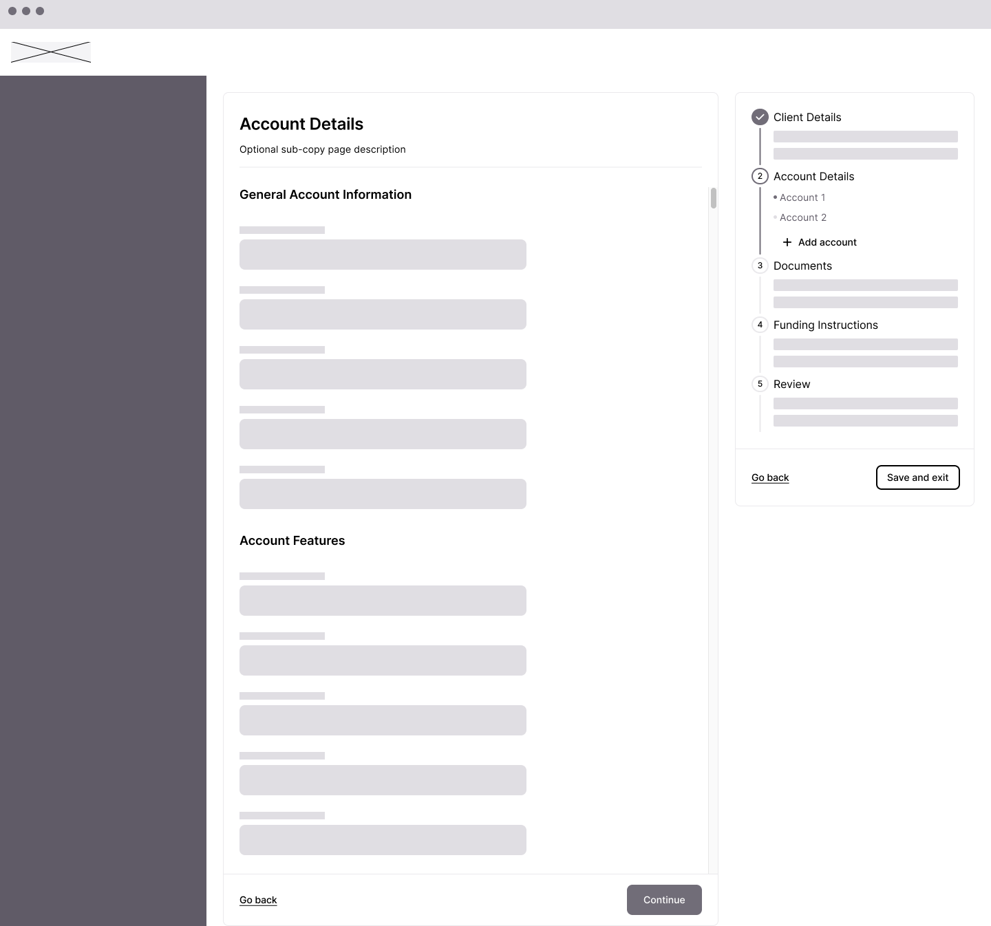
One specific change came directly from validation research. Users told us that Know Your Customer (KYC) information—broker dealer affiliations, regulatory disclosures—should be separate from basic client details. These were compliance requirements that felt out of place mixed in with contact information.
In early explorations, KYC fields were embedded within Client Details. Based on feedback, we separated KYC into its own section with clear sub-categories: Broker Dealer Affiliations and Regulatory.
KYC separated into its own section — research-driven change that removed compliance fields from client details
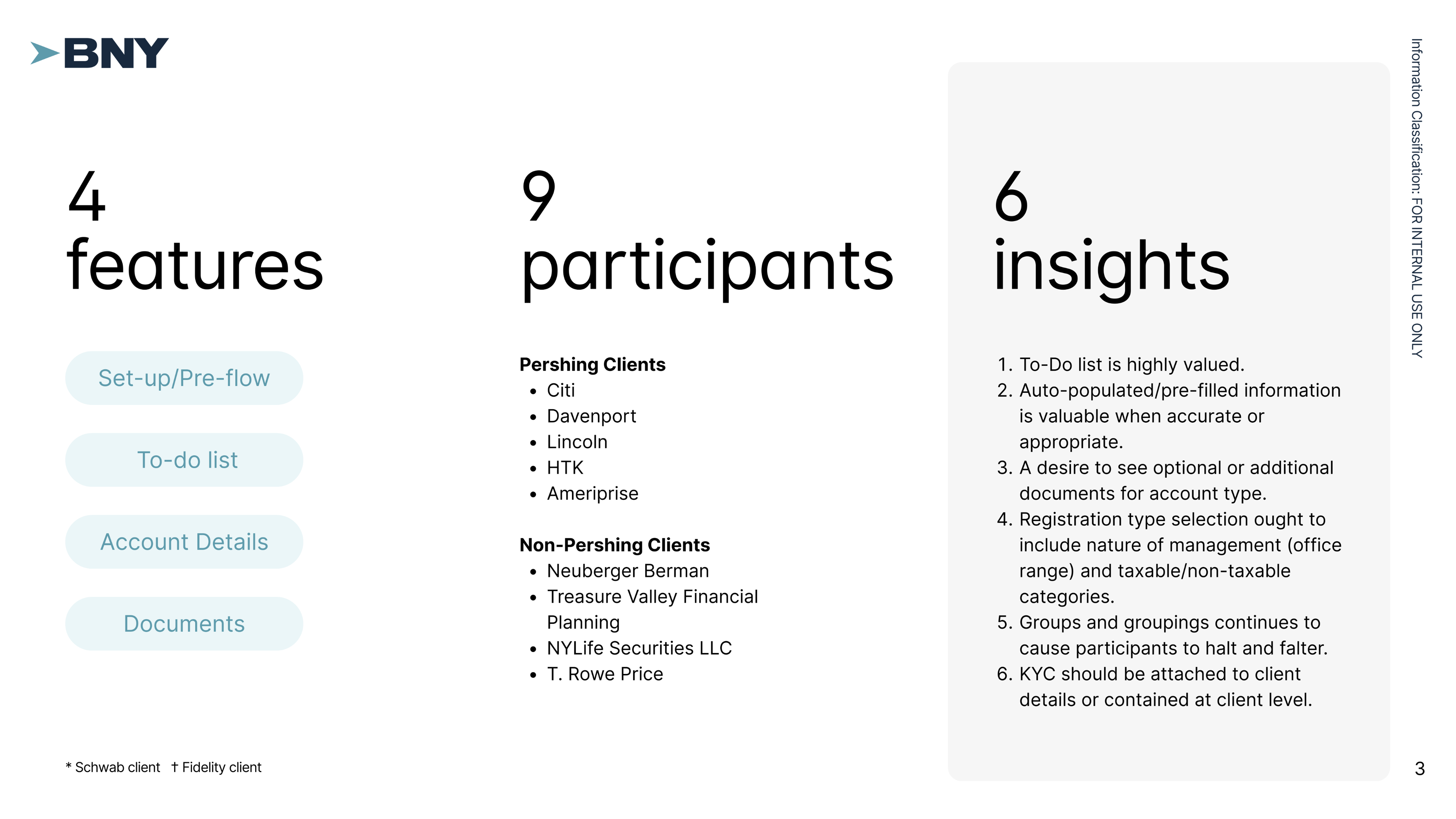
Validating with clients
We tested the designs with 9 participants from both Pershing clients (Citi, Davenport, Lincoln, HTK, Ameriprise) and non-Pershing firms (Neuberger Berman, Treasure Valley Financial Planning, NYLife Securities, T. Rowe Price).
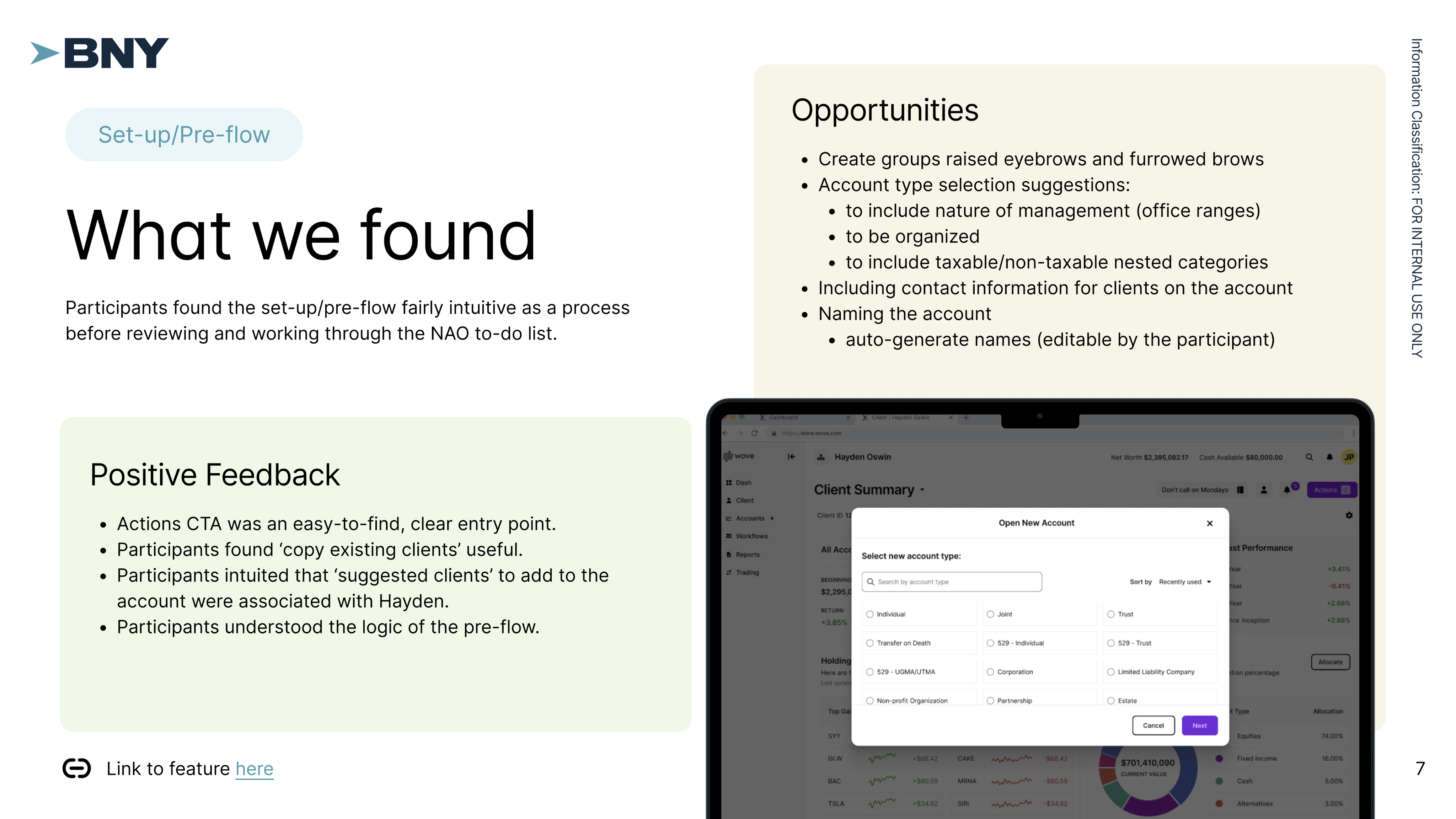
The To-Do List resonated immediately. Participants called it "a useful roadmap for tracking progress" and "a helpful checklist to guide users through the process." They valued being able to verify completion of each step and navigate non-linearly.
"The to-do list palpably reduced user cognitive load by indicating progress, location, and completion of steps in the NAO process."
The pre-flow logic landed. Participants understood the setup questions, found the entry points clear, and intuited features like "copy existing clients" without explanation.
What needed refinement
Groups and groupings caused confusion—the account type selection needed clearer organization. KYC placement was validated as correct in our revision. And "Submit" didn't mean "created"—we were conflating submission with completion.
Part Two
Asset Movement
💸
Where Is This Money Going?
Asset Movement has a different shape than account opening. It's more transactional—move money from here to there—but the legacy experience made even this simple concept feel dangerous.
Users entered Asset Movement from multiple places depending on how they'd been trained: the Balance screen, the Profile tab, or Servicing Asset Movement. Forms lived on a different screen than the asset movement itself, forcing reviewers to manually match documents to requests.
The deepest pain point was directional confusion:
"I'm scared somebody's going to click 'to' and send somewhere totally different because you didn't choose what you were trying to do from the beginning."
Our research identified two distinct user types with different needs:
Advisors initiated transfers occasionally, needed guidance through the process, and cared most about not making mistakes with client money.
Home Office / Operations staff processed transfers all day, every day. They needed speed and efficiency—the ability to see everything at once and move fast.
We explored designs for both personas, knowing we might need different experiences or a flexible system that could adapt.
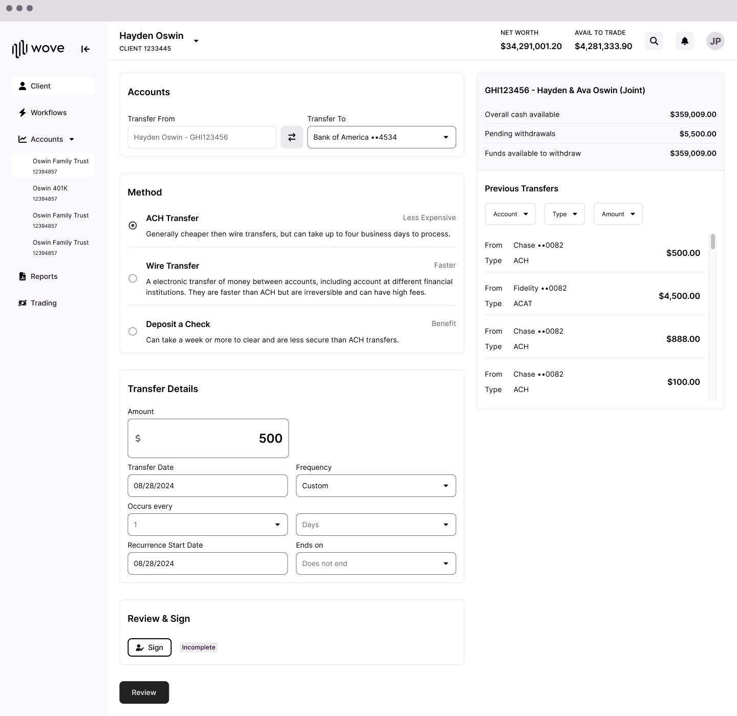
Exploring the power user experience
For operations staff, we explored a single-page approach where everything was visible at once: Assets, Schedule, Method, and Documents all on one screen with a Transfer Details sidebar showing the running summary.
Power user exploration: everything visible at once — speed over step-by-step guidance
This approach prioritized speed and scannability. Users could see the entire transfer at a glance, fill in what they needed, and submit without stepping through multiple pages.
However, we ultimately paused development on the power user experience to focus on the advisor flow. The advisor persona had clearer near-term priority, and the patterns we established there could inform the power user experience later.
🔧
The Collapsing Stepper
The worksheet stepper: First iteration
For advisors, our first iteration used a worksheet approach with a horizontal stepper: Accounts → Assets → Schedule → Method → Documents → Submit. Each step was a separate page within a modal.
V1: horizontal stepper in a modal — step-by-step but lacking full-picture visibility
We tested this approach and received mixed feedback:
Users liked the step-by-step guidance
But the document step caused confusion—users thought it was a summary, not a signature requirement
Firms had different requirements for documentation and verbal authorization
Users expected documents to be sent to clients for signature, not signed by the advisor
The separation of steps made it hard to see the full picture
"Thought Documents section was a summary page of transfer."
"Expected after submitting that the documents would be sent to client to sign."
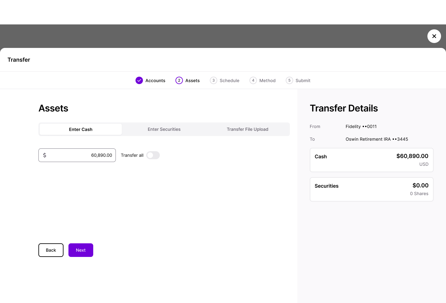
The collapsing stepper: Second iteration
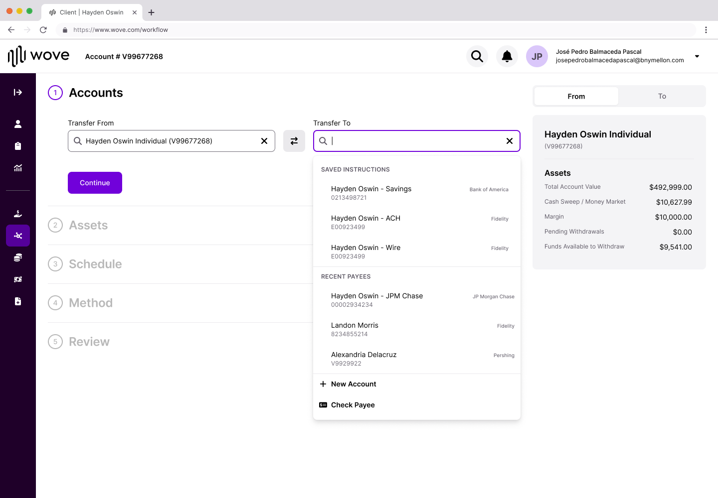
Based on feedback, I redesigned the step structure as a vertical collapsing pattern. Instead of separate pages, each step lives inline on the same screen. As users complete a step, it collapses into a summary card showing just the essential information—with an Edit button to go back if needed.
V2: collapsing stepper — completed steps collapse to summaries, building the full picture as you go
This solved multiple problems:
Progressive summary building. As each step completes, it collapses to show just the essential info. By Review, users see the full transfer picture without scrolling back through steps.
Edit without losing context. Every completed step has an Edit button. Users can go back without starting over or losing work.
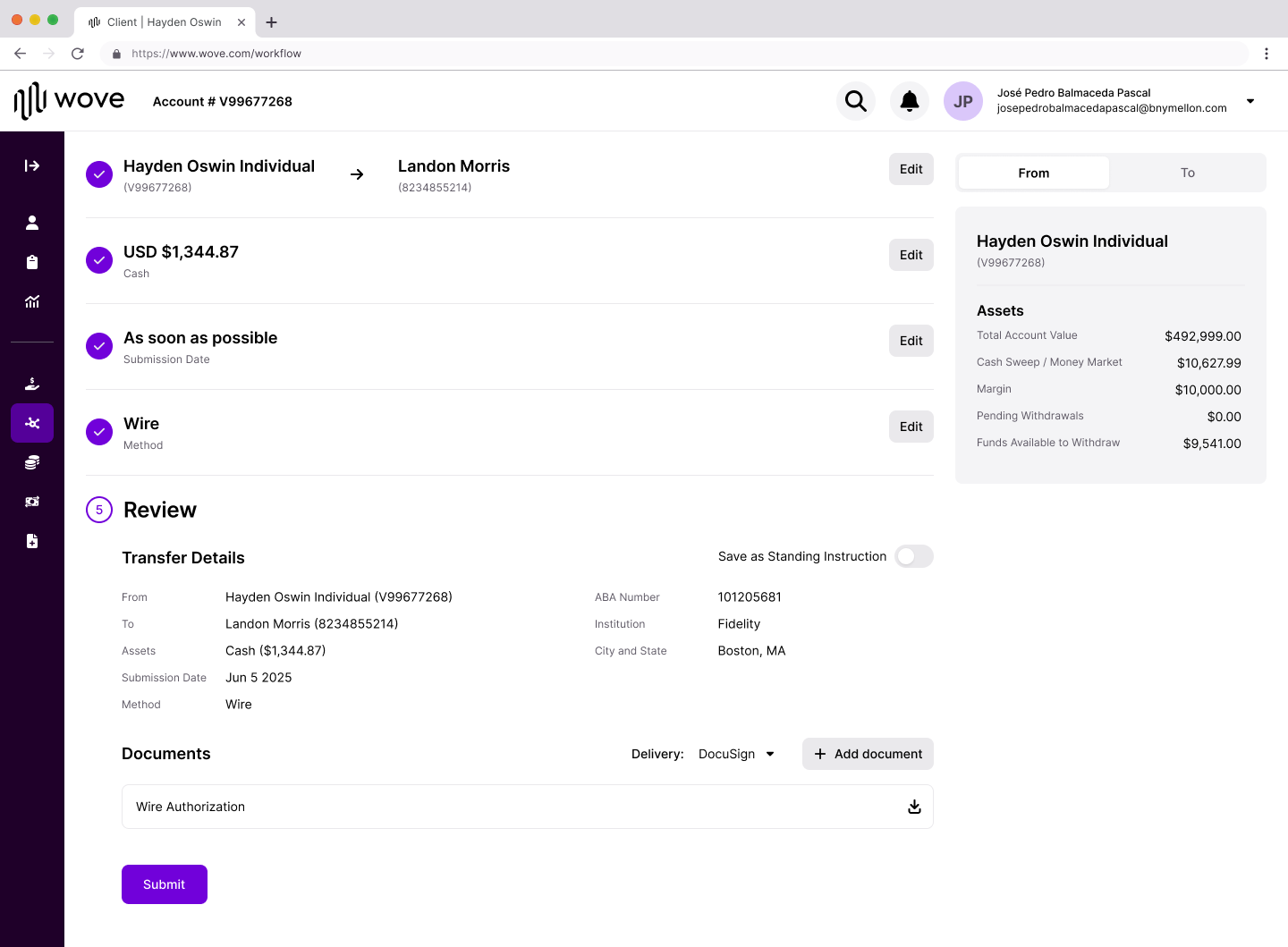
Direction always visible. Once accounts are confirmed, "Hayden Oswin Individual → JP Morgan Chase" stays locked at the top. No more fear of sending money somewhere unintended.
Saved Instructions at point of need. Research showed users wanted to reuse common transfers. Now they see saved and recently used instructions immediately when selecting the destination.
Saved Instructions surfaced at point of need — eliminates manual re-entry for common transfers
Method follows asset type
One key change came from our design lead: instead of asking for the transfer method upfront, we ask what assets are being transferred first. The available methods then filter based on what makes sense for that asset type.
This prevents impossible combinations and removes cognitive load from users who might not know which methods apply to their situation.
Method step: options filter by asset type — users see only what's valid for their transfer
🎯
The Common Thread
Looking across both workflows, the design principles are consistent:
Principle
NAO Implementation
Asset Movement Implementation
Make progress visible
To-Do List with completion states
Collapsing stepper with summary cards
Support non-linear work
Click any section to jump
Edit buttons on every completed step
Show the full picture
Nested sections reveal scope
Progressive summary builds to Review
Surface what users need
Pre-flow captures key decisions
Saved Instructions at destination selection
Be honest about complexity
All steps visible upfront
All steps visible, collapsing as completed
The underlying insight is the same: in complex workflows, the answer isn't to hide complexity. It's to make complexity navigable.
The outcome
Neither workflow shipped—not because the designs failed, but because they're vision work for a platform still being built. Wove's core features need to come first. These designs are validated and documented, ready for implementation when the roadmap prioritizes them.
For NAO:
Research Finding
Design Response
Users can't track progress across multi-participant workflows
To-Do List shows completion status for every section
Linear forms hide true complexity
Non-linear navigation lets users jump to any section
Advisors rarely have all client information
Collaborative flow with "Send to client" capability
KYC feels out of place in client details
Separated KYC into dedicated section
Configuration doesn't copy correctly
Pre-flow captures key decisions before the main flow
For Asset Movement:
Research Finding
Design Response
Direction confusion causes fear
From/To visible at all times, locked after confirmation
Document step confused with summary
Clearer labeling and progressive disclosure
Firms have different authorization requirements
Flexible document handling
Repetitive transfers require manual re-entry
Saved Instructions and Recently Used surfaced at point of need
NAO — To-Do List workflowAsset Movement — Collapsing Stepper
🔮
Reflection
This project taught me the difference between designing a feature and designing for a system in transition.
We weren't just improving forms. We were establishing patterns that would need to scale across an entire platform consolidation. The To-Do List and collapsing stepper aren't just solutions for NAO and Asset Movement—they're approaches to making any complex workflow navigable.
The exploration phase was critical. We didn't jump to the To-Do List pattern—we arrived at it by systematically evaluating alternatives against research findings. The dashboard approach, the sidebar stepper, the collaborative flow—each exploration taught us something about what users needed and what the structure had to support.
The hardest part was designing for a future we couldn't fully see. Wove will evolve. Requirements will change. What we could do was establish principles flexible enough to adapt: make progress visible, support non-linear work, show the full picture, surface what users need, and be honest about complexity.
Vision work doesn't always ship immediately. But it shapes what's possible when the time comes.
FPL Case Study
Overview
The Setup
Research
Reframing
The Design
Constraints
Outcome
Reflection
💰
Turning Overlooked Revenue into Action
Fully Paid Lending lets advisors earn fees by lending their clients' shares—but the tool designed to surface these opportunities was collecting dust. I led the redesign of an underutilized NetX360 feature into something advisors would actually use.
Dimension
Details
My Role
Lead Studio Designer
Team
Design Lead, Development Lead, 2 Developers, Product SME, Project Lead
Timeline
1 year (kickoff to client release)
Outcome
Shipped February 2026
⚡
The Tool No One Used
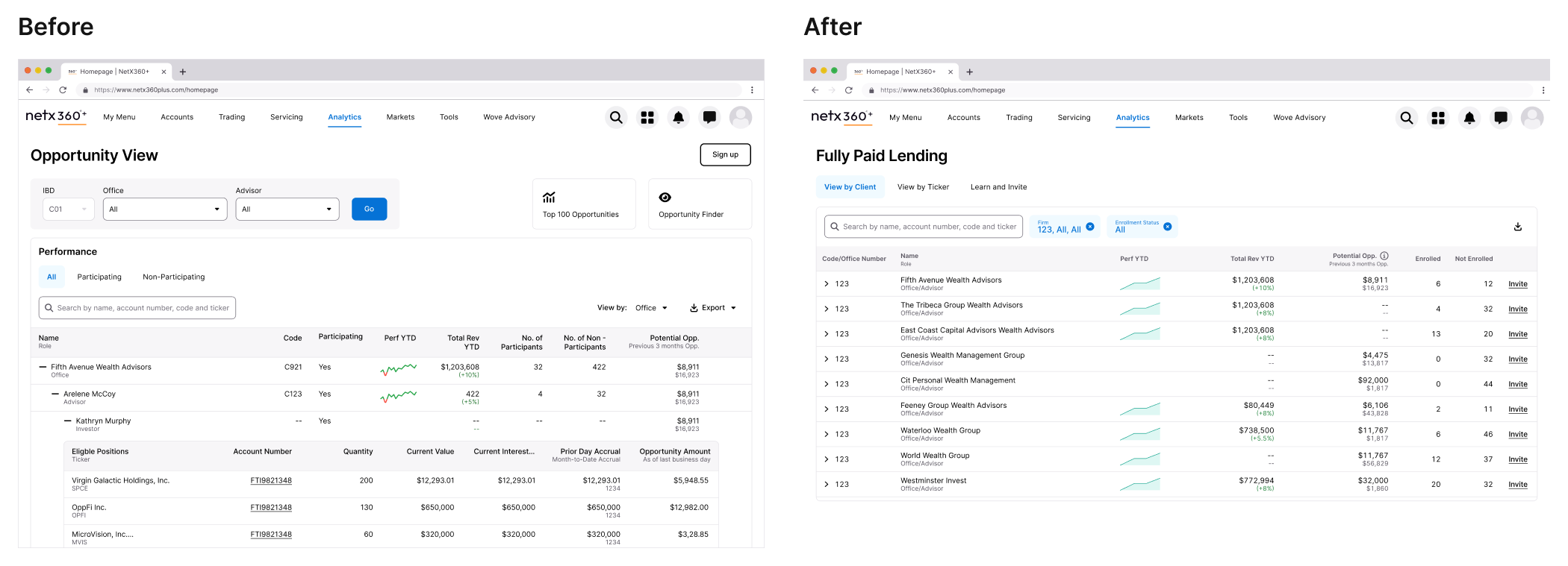
Fully Paid Lending is a straightforward value proposition: advisors can lend shares their clients already own and generate passive revenue. BNY Pershing had a tool to help advisors identify these opportunities—but adoption was dismal.
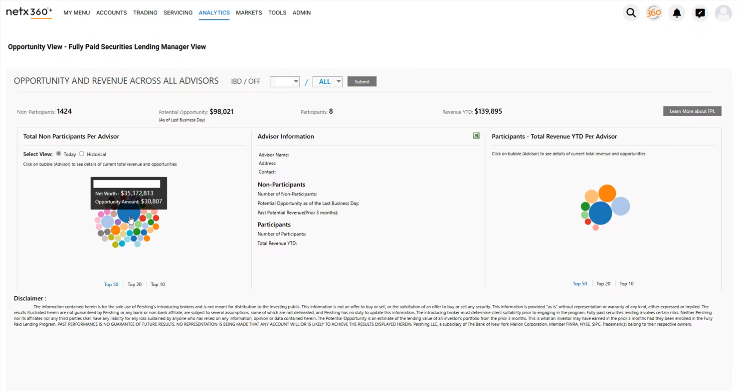
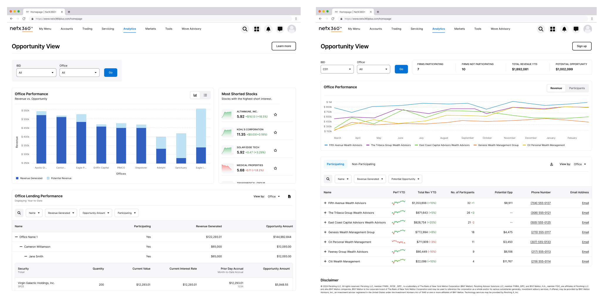
The existing Opportunity View page in NetX360 had all the data. It showed potential revenue, participating clients, and historical performance. On paper, it should have been valuable. In practice, advisors were ignoring it entirely.
"The tool had the data. It just made users work too hard to extract value from it."
The existing interface centered on a bubble visualization that research revealed users were skipping entirely.
🔍
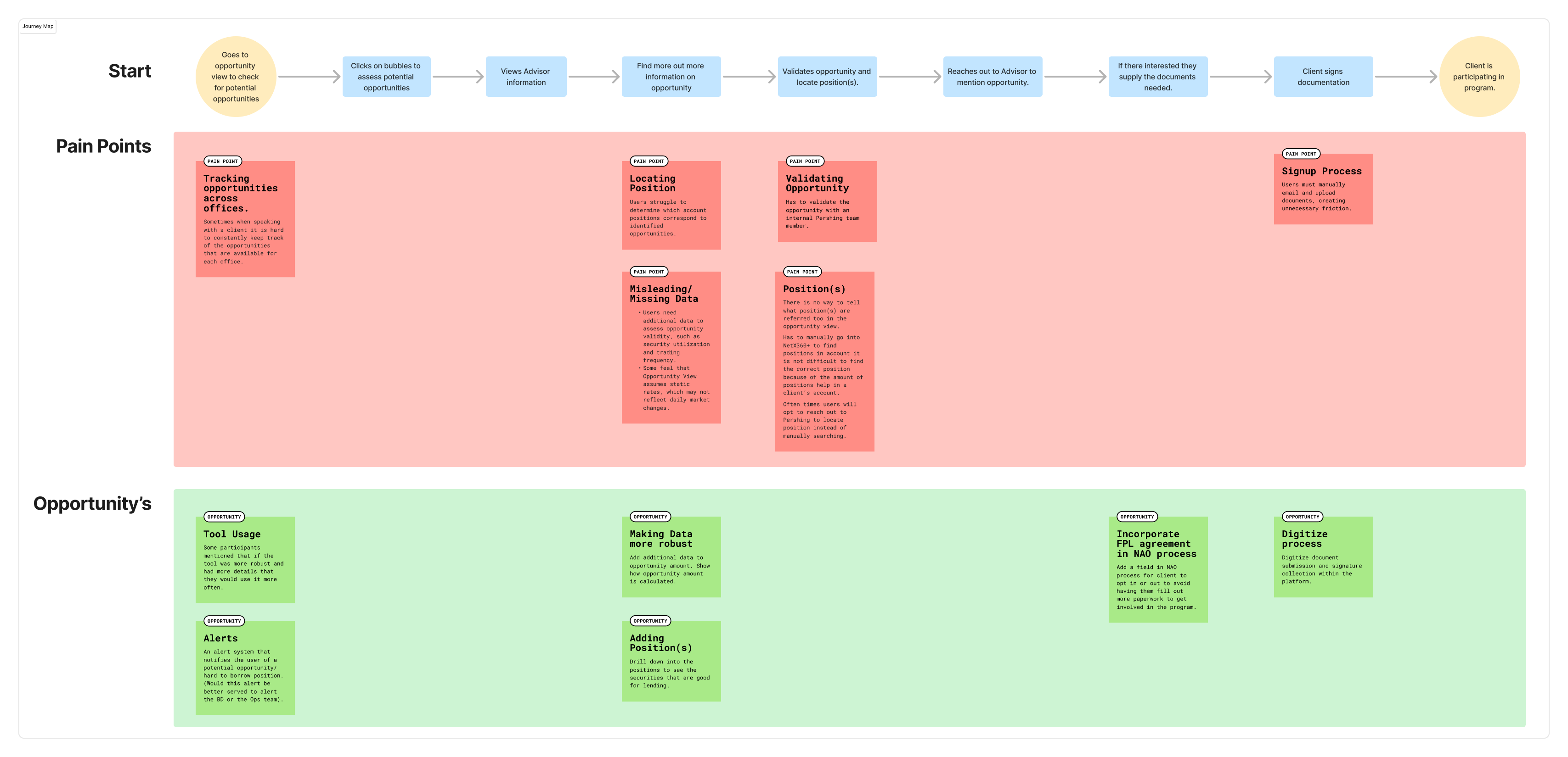
Listening to the Workarounds
Without pre-existing insights, I partnered with our research team to understand how advisors were actually engaging with the tool. We conducted research with participants across different roles—from advisors managing individual client relationships to home office managers overseeing entire networks.
The findings were clear: users had developed elaborate workarounds because the interface wasn't meeting their needs.
📊
Research findings summary or affinity map showing key themes
Bubbles Were Decoration
The interface's centerpiece was a bubble visualization—larger bubbles indicated bigger opportunities. The assumption was that visual hierarchy would help advisors prioritize.
Reality was different. Users understood what the bubbles represented, but found drilling into each one inefficient. Most skipped the visualization entirely and exported everything to Excel, where they could sort, filter, and cross-reference with other tools like Bloomberg.
"Some users do not engage with the bubbles at all and rely on Excel exports."
Users understood larger bubbles meant bigger opportunities—but the interaction model failed them.
The Data Wasn't Trusted
Advisors needed context the tool didn't provide. They wanted to assess opportunity validity—factors like security utilization and trading frequency—but the interface showed potential revenue without explaining how it was calculated.
Some felt the system assumed static rates that didn't reflect daily market changes. Others questioned whether the numbers were realistic at all. Without transparency, advisors were hesitant to act on what they saw.
Friction Killed Enrollment
Even when advisors identified opportunities worth pursuing, the enrollment process stopped them cold. Onboarding clients into the lending program required manual emails, document uploads, and back-and-forth that created unnecessary friction.
The tool could show you the opportunity. It couldn't help you capture it.
🎯
Reframing the Problem
The research painted a clear picture: this wasn't a feature problem. It was a usability problem compounded by a trust problem.
The original interface asked users to interact with data in ways that didn't match their mental models. It prioritized visualization over utility. It obscured methodology instead of revealing it. And it dead-ended at the moment of action.
Mapping the breakdown points revealed that problems clustered around data interpretation, navigation efficiency, and enrollment friction.
The core design challenge became:
The Core Question
"How do you surface dense financial data in a way that supports quick scanning and deep investigation—without forcing users into a separate tool?"
✨
From Visualization to Information
The most significant design decision was killing the bubble visualization entirely.
Research showed users were bypassing it for Excel exports. They wanted to scan across offices and advisors quickly, drill into specific positions when needed, and take action without leaving context. Bubbles didn't support any of these behaviors.
I explored multiple directions—bar charts, various table configurations, hybrid approaches—before landing on an expandable nested table as the primary interface.
Early explorations tested different ways to represent the same data. The expandable table emerged as the strongest pattern for supporting both scanning and investigation.
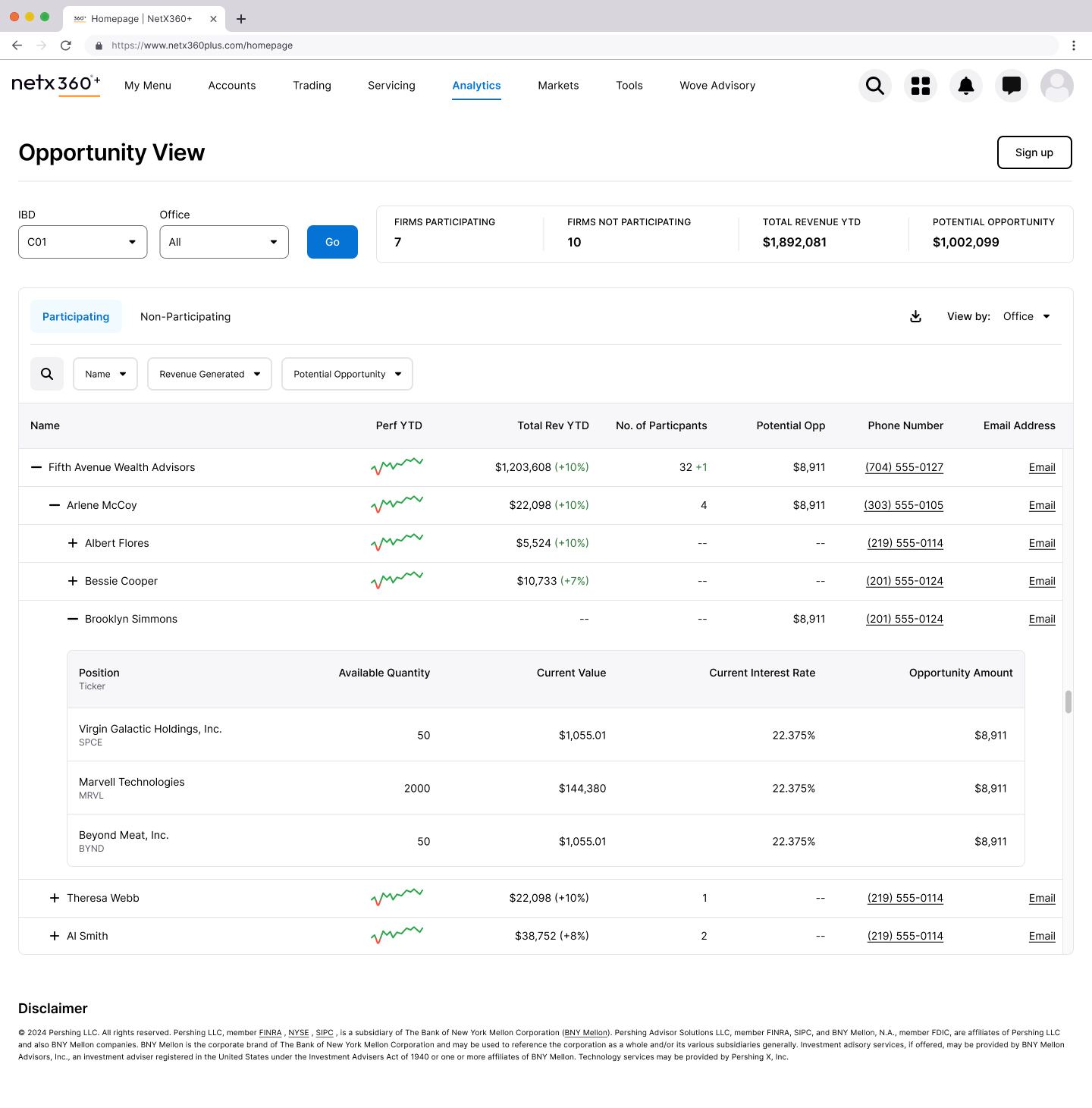
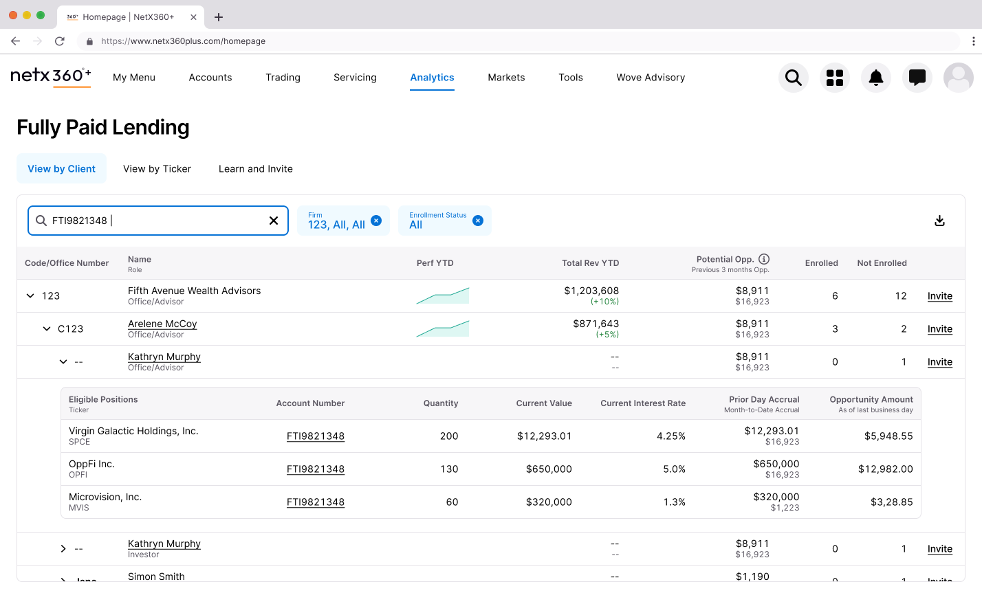
The Nested Table
The final design uses a three-level hierarchy: Office → Advisor → Investor. Users can scan across the top level to identify high-opportunity offices, expand to see which advisors are driving those numbers, and drill further to individual investor positions.
This pattern solved several problems simultaneously:
Scanning: Managers can quickly compare performance across their network without clicking into separate views
Context preservation: Expanding a row keeps surrounding data visible, unlike the old drill-down flow that lost context with each click
Flexibility: The same structure works for both manager and advisor views, reducing cognitive load when switching between perspectives
The expandable table lets users drill from office to advisor to investor without losing context.
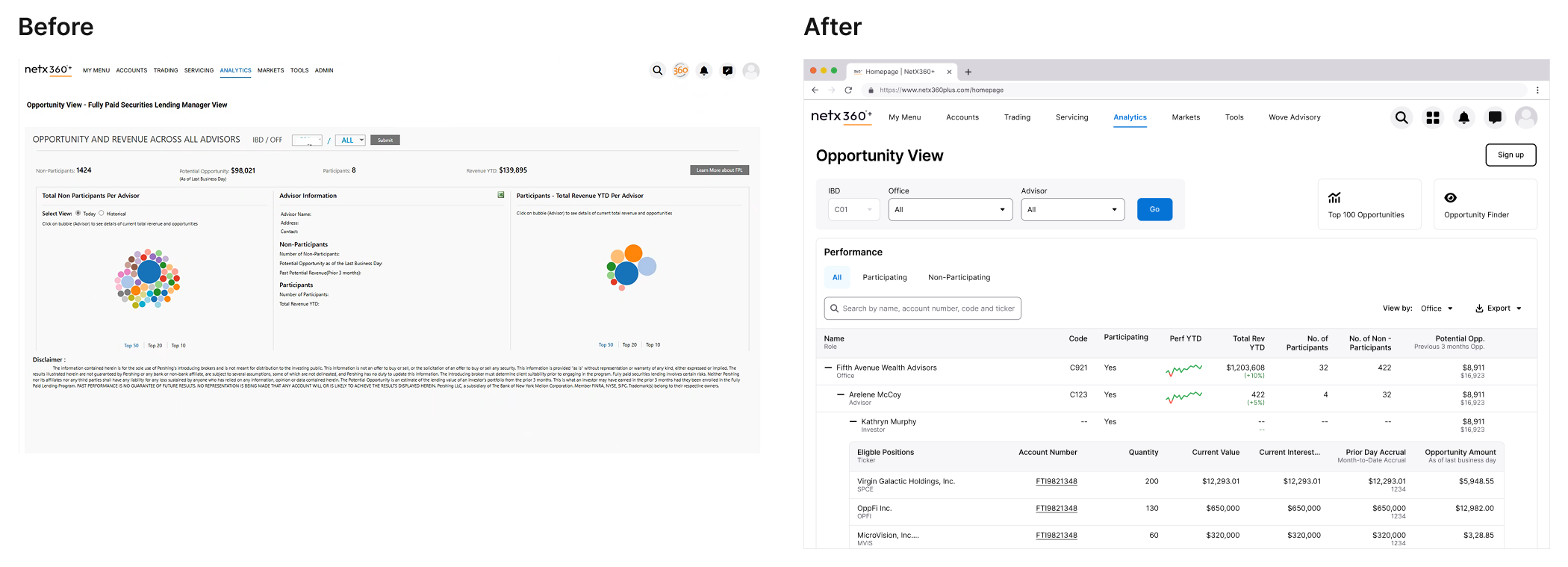
Reclaiming the Space Above the Fold
A consistent complaint across BNY Pershing products was content being pushed below the scroll. The legacy FPL page stacked filters, tabs, summary statistics, and navigation elements—leaving actual data buried.
I audited every element above the fold and challenged whether it earned its placement.
The legacy interface (left) buried actionable data below multiple navigation layers. The redesign (right) prioritizes the table.
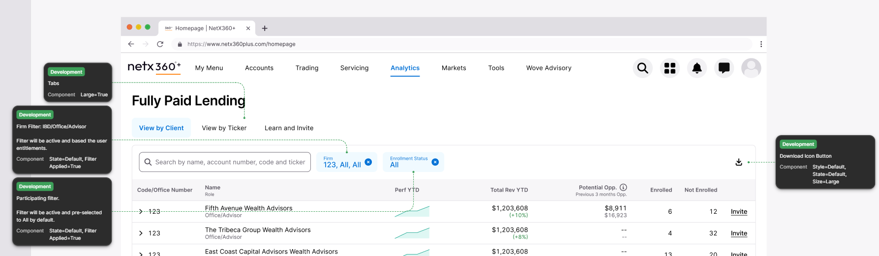
What Got Removed
The IBD/Office dropdown filters. These duplicated functionality now handled by the table's expandable hierarchy and inline filtering.
The separate "Top Opportunities" section. Valuable content, but it competed with the primary table. I moved this to a dedicated "View by Ticker" tab where users seeking specific securities could find them intentionally.
The Participating/Non-Participating tab split. Instead of forcing users to toggle between views, I added Enrolled and Not Enrolled columns inline. One view, complete picture.
Enrollment status is now visible at a glance rather than hidden behind tab navigation.
What Got Added
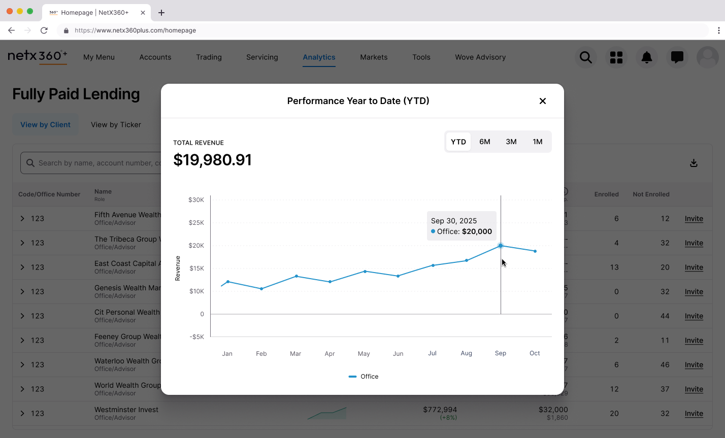
Sparklines for performance trends. A small inline visualization showing YTD performance lets users spot patterns without leaving the table. Clicking opens a modal with the full chart—progressive disclosure that keeps the primary view scannable.
Sparklines provide trend information at a glance. The modal reveals full detail on demand.
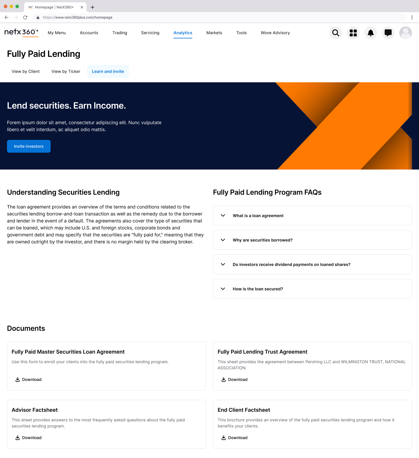
A "Learn and Invite" tab. Consolidating program information and the enrollment flow in one place addressed the friction that killed adoption. Advisors can understand the program and take action without leaving the tool.
Reducing enrollment friction from manual email workflows to an integrated flow.
From Insight to Action
Identifying opportunities is only valuable if users can act on them. The legacy enrollment process required manual emails and document uploads—friction that meant opportunities sat untouched.
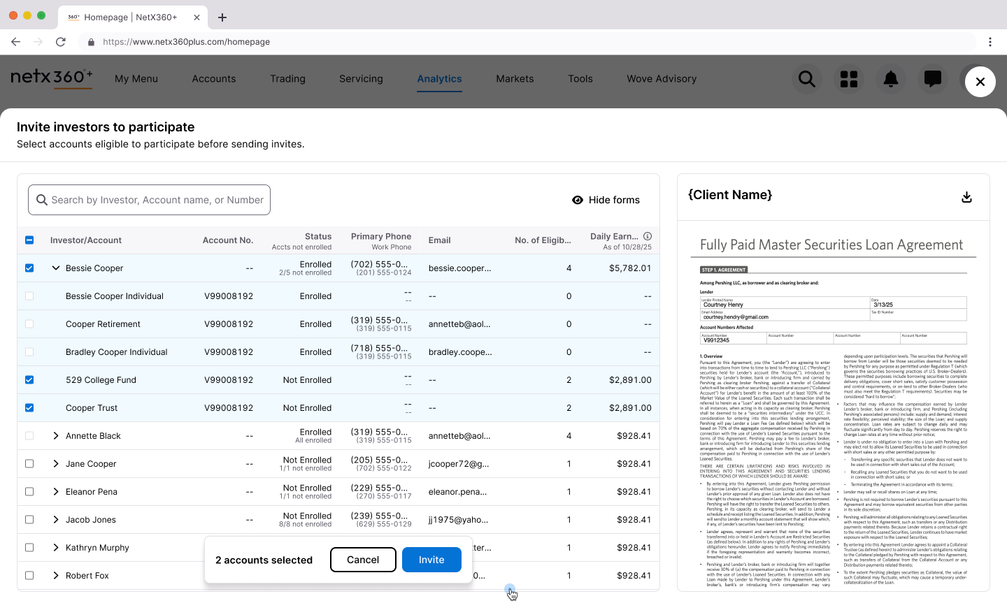
The invite worksheet lets users select eligible accounts directly from the table and send enrollment forms in a single flow. Status is visible inline (Enrolled, Not Enrolled, partial enrollment states), and users can preview the actual agreement before sending.
Enrollment integrated into the workflow: select accounts, preview forms, invite—no context switching.
🎉
The Outcome
The redesigned Fully Paid Lending page shipped to clients in February 2026. While we're still gathering post-launch feedback, every design decision was validated through iterative review with both internal stakeholders and anticipated client needs.
The redesign directly addresses every major pain point from research:
Research Finding
Design Response
Bubble visualization ignored
Replaced with scannable nested table
Drill-down lost context
Expandable rows preserve surrounding data
Content buried below scroll
Consolidated hierarchy, removed redundant elements
Participation status unclear
Inline Enrolled/Not Enrolled columns
Top opportunities hard to find
Dedicated "View by Ticker" tab
Enrollment friction
Integrated "Learn and Invite" flow
Data trust issues
Transparent methodology, progressive disclosure
The final design: a scannable, expandable table with inline status, integrated enrollment, and dedicated views for different user goals.
🔮
Reflection
This project reinforced something I keep relearning: "underutilized" is usually a design problem wearing a feature costume.
The original FPL page had the data. It even had the right idea—help advisors find revenue opportunities. But it presented information in ways that didn't match how users actually worked. They needed tables, not bubbles. They needed inline context, not drill-down journeys. They needed to act, not just observe.
The biggest lever wasn't adding features. It was removing friction and consolidating information so the tool could get out of the way of the work.
From overlooked to actionable: the full transformation of the Fully Paid Lending experience.
Purple Panda
Overview
The Problem
Research
Competition
Design
Testing
Iteration
Reflection
🏠
Building the Platform I Wished Existed
Every college student faces the same problem: finding off-campus housing is chaos. I didn't just design a solution—I founded a company to build it. Purple Panda Rentals is the rental platform I wished existed when I was a student.
Dimension
Details
My Role
Founder & Product Designer
Timeline
2 months (mobile app design)
Research
4 interviews, 270 survey respondents
Outcome
Validated mobile app design for launched platform
Purple Panda Rentals: a rental platform built for how college students actually search.
😤
The Problem Was Personal
Finding off-campus housing as a college student is a mess. You're competing with other students for limited listings, negotiating with landlords who don't take you seriously, and trying to coordinate move-in dates around academic calendars that don't align with standard lease terms.
I lived this. So did everyone I knew. The options were Zillow (not built for students), Craigslist (sketchy), or word-of-mouth (limited). None of them understood the specific needs of college renters.
So I started Purple Panda Rentals—a rental listing platform built specifically for college students. The website launched in December 2023. The next step was mobile.
"Along with saving money, students benefit from the independence and housing flexibility that off-campus housing provides."
🔍
Validating the Problem at Scale
Before designing the mobile app, I needed to confirm my assumptions weren't just my own experience. I ran a nationwide survey with 270 college students and conducted interviews with four former students about their leasing and searching habits.
What are your first steps when looking for off-campus housing?What's important to you in off-campus housing?
What I Expected
The survey confirmed what I suspected:
76% currently live off-campus
53% use Zillow to find housing (a tool not built for them)
57% said proximity to campus was the most important factor
51% said rental price was the deciding factor
Students were using generic tools because nothing better existed.
What Surprised Me
The survey also revealed pain points I hadn't fully appreciated:
81% prefer to stay in one apartment for multiple semesters—stability matters more than I assumed
42% found it frustrating to find someone to sublease their apartment between semesters
34% had maintenance and landlord issues with no way to vet reputation beforehand
15% struggled to calculate total cost when rent, utilities, and living expenses were listed separately
The sublease problem was bigger than I expected. Students weren't just looking for housing—they needed to offload housing when plans changed.
"Finding a student to sublease their apartment was frustrating between semesters."
User interviews revealed consistent themes: affordability, proximity, safety, and responsive landlords.
🎯
The Competitive Gap
I audited both direct competitors (student-focused platforms like College Pads) and indirect competitors (Zillow, Apartments.com). The pattern was clear:
Mainstream platforms had the best user experience and largest inventory—but no student-specific features.
Student platforms had relevant features—but clunky interfaces and limited listings.
No one had married Zillow's usability with features tailored to the college experience.
The opportunity: combine mainstream usability with student-specific features.
✨
Designing the Mobile Experience
With the research foundation set, I moved into designing the mobile app. The website was live; now students needed to search on the go.
Information architecture balancing familiar real estate patterns with student-specific features.
The Sublease Decision
When defining the app's scope, I faced a tradeoff: include a sublease section or a roommate matcher? Both had value. I couldn't do both well in the initial release.
The research made the call. 42% of students found subleasing frustrating—a concrete pain point with high frequency. Roommate matching got positive feedback in interviews, but sublease functionality addressed a more urgent, more frequent need.
I prioritized sublease. Roommate matching went on the roadmap for future releases.
"Based on the students I researched, a sublease section prioritized over finding a roommate. This finding surprised me."
User flow designed around the core job: find a listing, evaluate it, save it for later.
The UI System
Purple Panda's brand was already established from the website—bright, approachable, student-friendly. The mobile app needed to extend that identity while meeting iOS conventions.
Design system built to maintain brand consistency across web and mobile.
🧪
Testing with Real Users
I built three prototypes in Figma and ran usability tests through Maze with 17 participants. Three tasks, representing the core use cases:
Create an account and complete onboarding
Search with filters and favorite a listing
Find a sublease and message the student
What Worked
Task 1: Account creation — 100% success rate. Onboarding questions were appropriate and completion time was adequate.
What Didn't
Task 2: Search and favorite — 85% success rate. Users struggled with the filter screen (clicking text instead of toggles) and couldn't easily see the heart icon for favoriting.
Task 3: Sublease and messaging — 63% success rate. Users couldn't find their way back to the inbox after sending a message. The back arrow was too subtle.
The problems were specific and fixable. I iterated.
Task 2 iterations: navigation menu, header layout, and filter functionality improvements.Task 3 iterations: nav menu functionality and pop-up modal improvements.
📈
After Iteration
I ran the tests again with the updated designs.
Task
Before
After
Search and favorite
85%
100%
Sublease and messaging
63%
100%
The changes worked. But testing also surfaced a deeper issue I hadn't fully solved: trust.
Users questioned whether they could trust a stranger subletting an apartment. Security and reputation weren't addressed in the current design. For future iterations, I noted the need for verified student profiles or review systems—features that would take more than UI changes to implement properly.
Affinity mapping user feedback to guide design iterations.
🔮
Reflection
Purple Panda taught me the difference between designing for a prompt and designing for a real problem.
When you're the founder, there's no brief to fall back on. You have to define the problem yourself, validate it with real people, and make tradeoffs that affect a real business. The sublease vs. roommate decision wasn't academic—it determined what the product would actually do.
The usability testing reinforced something I keep relearning: you can't predict where users will struggle. I thought the filter screen was straightforward. Users disagreed. The only way to find out is to put the design in front of real people and watch what happens.
What's next: the publisher side of the platform (for landlords listing properties) and the trust features that testing revealed were missing. Building a product is never done—you just ship what you can and keep learning.
Purple Panda Rentals: from personal frustration to launched platform.


.png)
.png)
.png)


.png)


.png)